Wednesday, 29 April 2015
Evaluation
These are my final images that I have produced they're taken from 5 different photo shoots I have done and all have different meanings behind them. I really like the way the photos turned out. On the first photo I like the composition but I think I could have made the exposure a bit lighter but it was a very dark room so I had to use the flash but I also didn't want it to be to bright because it was meant to be quite a gloomy photograph. The reason behind the first photo was to show a lack of confidence and
Shoot 2
Shoot 2
This shoot was to do with the freedom of dance and the way it can be shown in different ways. A lot of these photos didn't turn out with the shapes that I wanted. I had to do a self portrait because my model let me down last minute and I couldn't find anyone else to replace them.
Tuesday, 14 April 2015
Shoot 1
This shoot was done as a test shoot I was testing different areas. I was also testing my bounce flash inside. I do like the photos but the only problem with them is that I used my 5 year old brother as a model and because he is a child it was had to get him to pull a nice/serious face. I think the exposer on the photos outside but I like the look that it gives. I only edited it by moving the contrast and brightness up a little bit, I also raised the levels a little to add more light into the photo. This is the only photo of him that his face isn't really stupid. If I was to do this again I would get something to try take his mind off the photos being taken. This was to get a taste of the locations and what the photos could potentially look like. If I did this shoot again I would also maybe use a bounce flash outside swell to let a bit more light into the photo as it was quite dark when I took the photos. I could also do this in a more open space but i love the wear on the wall it gives it a real good effect. Also there is thinking space in the photograph and because it is a child it gives the photo a different feeling. Like normally a child will be thinking what pudding is coming after tea, what TV program to watch next, what toys to play with, what they want for christmas etc. It also shows the difference on how different generations dress and the way youths are evolving.
Monday, 13 April 2015
Layer Masks
I really like this technique because if you was to do something serious then you could show all emotions or different stories in one shot. This is done by using different layer masks and the eraser tool.
Wednesday, 18 March 2015
Hand Painting a Black and White Photograph
I did this painting by hand painting onto a photograph, the colors that i have used aren't the actual colors on the photograph. Its like a traditional technique that they used to use in the dark room. The would add ink or a dye to the places they would want it and make it from there. This was seen as a arty way of photography and combining the two together. You can now do this digitally in photoshop which is more precise and you can get the colors more natural. This is good for if you wanted different colours in the picture as you could take different sections and make them either unnatural or more natural. I do like this kind of method but it takes a lot of time and you need to be good with shading, I think if i had some practice this could be fun to do.
Film grain
This is to interoperate a old film camera where the film would have a high ISO, it would react to the light and create the grain look. Even now on the new digital cameras if the ISO is too high the photos would appear grainy and noisy. I do like this effect because even though it is a new photo it gives it a old effect.
Monday, 16 March 2015
Liverpool Trip
I know this is a photogram that was made in the dark room. I think this was made by a large bit of photographic paper and bent it to get the shape of the glasses. I think the message is making people look at everyday objects in a different way. I also think it is set out to confuse people and makes them think about the work its more appealing. It is creative and very technical it would be hard to create and he was obviously thinking outside the box with it. These relate to out project be being creative and using different techniques. The exhibition as a whole wasn't my cup of tea, I didn't really like not being able to see the detail. Also it looks very simple for something so technically difficult. I can see how the work interacts with the audience because it is confusing and things people are used to looking at.
This image is showing two girls who are on a break from a dance show on top of a building. It tells a story to us with the way they're dressed and the fact they're both looking at a book of something. The other reason it tells a story is the background and what the area is like what they're in. This relates to out project with the old and new theme in the way the exhibition was set out. It was set out in three different sections starting with 'The Aftermath of the War' which is the old when the war had just destroyed japan Then the 'Between Tradition and Modernity' which was in the middle of it being built up for the Olympics and “Towards a New Japan.” which was when they had just rebuilded it.
This image is showing two girls who are on a break from a dance show on top of a building. It tells a story to us with the way they're dressed and the fact they're both looking at a book of something. The other reason it tells a story is the background and what the area is like what they're in. This relates to out project with the old and new theme in the way the exhibition was set out. It was set out in three different sections starting with 'The Aftermath of the War' which is the old when the war had just destroyed japan Then the 'Between Tradition and Modernity' which was in the middle of it being built up for the Olympics and “Towards a New Japan.” which was when they had just rebuilded it.
Wednesday, 11 March 2015
Low key lighting Text overlay
I put the the image into photoshop and used auto color.
I then changed the image into black and white.
Then I got some quotes from the models favorite film and typed them out. I then screen grabbed it and put it on top of the image.
I then hanged the drop down menu from normal to overlay to get rid of the white. on the text image.
Then change the opacity to where you want is and erase the text where you don't want it.
Faltern your image and then its done.
I used this lighting setup to ensure I had the best results for my image.
Monday, 9 March 2015
Vignette
First add a new layer and select the middle with a oval then invert it.
then go to modify an feather then a box will come up and but a number depending on the quality of the photo.
Then change the opacity to what you want.
This is what the final outcome is.
then go to modify an feather then a box will come up and but a number depending on the quality of the photo.
Then change the opacity to what you want.
This is what the final outcome is.
Cyanotype
Open up the image in photoshop.
Then go on hue and saturation, Go to where it says custom, then go to Cyanotype.
Then your final image should look a blueish color.
Here are some different examples of cyanotype.
Old look
First I opened up the picture in photoshop.
Then you drag in a clear picture of brown crumpled paper into photoshop over the image and fit to the exact size of the picture.
Then you go to opacity at the right hand side of the screen, move it to between 50% and 60%.
Then click background and go on photo filter.
Click on Sepia and go to around 50% and 80% depending on how old you want it to look.
This is the final outcome.
These are some more examples of this effect being done.
Project Plan
At first I wanted to do something like the photo above for my installation piece so then I could get people involved and used different materials and change what the photograph looks like. I would of used different materials to do with the things in the photo.
The photograph
For my photograph I am going to take my sister out into different areas in my dancing dress. This is going to show the freedom of dance. Thinking about the theme old and new I am using a old camera lens. it is a minolta 50mm prime film camera lens. I am basing it on the freedom of dance because you show emotions through it etc. I am going to take my sister to different place happy places and bad places in this dress and showing literally some of the things people tell us about in dance. The idea hasn't just come from me thinking this is a good idea its going through some experiences myself, family or friends have been through and showing it is easy to hide some things from the real world. Also that a lot of people show it through dance as it isn't obvious whats going on. Im not sure where I'm going to take all the photos yet but I know one of the photos is going to be in a park because its a happy place full of people having fun, another place I'm going to go is down a back ally because it is dark and its usually where people go in dark times for example if someone had turned to drugs it would of been a good place to hide away from everyone. Im not sure about the rest of the shoots but I'm thinking about going through all the emotions. I am going to shoot at 1.7 aperture to get a shallow depth of field on my photos, I am going to used 1/160 of a second because there maybe movement in the background and I wouldn't want it to blur, Im hopefully going to use a ISO of 100 or 200 so it is a sharp image. I'm going to take the photos between 12pm and 6pm depending on what feel I want from each shoot and i don't know what days I'm doing it but before hand I'm going to check the weather forecast. The equipment I'm going to need is my camera, my 50mm minolta lens, maybe a tripod depending on what the shoot it, memory card, my model, my dancing dress. I'm going to wear warm clothes because its quite cold outside at the moment.
The installation
For the installation its self I'm going to project the pictures of 2 pieces of material. The 2 pieces of material are going to be relevant to the image as in they will be the same material that the dancing dress is made of. Im going to buy these materials from a material shop and buy 2x2m2 for £10 each. The installation is going to be set out in the way that its in front of the door and people walk through the picture. I think this would be good because its the start of the installation pieces and its interest for the public when they first walk in, it will draw there attention.
I think this is creative because its different to just framing a plain picture on the wall, also I may add a effect on the photo depending on the photograph which would make it even more creative.
Thursday, 5 February 2015
Techniques in photoshop
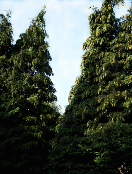
dodge and burn
I don't really like the way it changes the sky and makes it more white but i like the way it makes the shadows darker and the trees greener. It also makes some parts lighter then other parts and it looks messy.
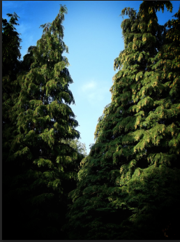
vignette
I like the way its dark and then goes brighter i think it would look better with a portrait.
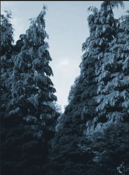
cyanotype
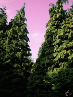
Precision color

Polaroid

word thing
Tuesday, 27 January 2015
Research
Matt
Wisniewski
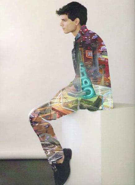
 I really do like his work its interesting hes taking photos of people in a studio and then photos out in the street, then making a double exposure but limiting it to one part of the photo not doing it to the whole thing. I don't think these photos really tell a story or if they're meant to but I just find them really interesting to look at. I like the way he has used black and white with color and used similar colors in the other photo from her jacket and the shop signs.
Wisniewski

 I really do like his work its interesting hes taking photos of people in a studio and then photos out in the street, then making a double exposure but limiting it to one part of the photo not doing it to the whole thing. I don't think these photos really tell a story or if they're meant to but I just find them really interesting to look at. I like the way he has used black and white with color and used similar colors in the other photo from her jacket and the shop signs.
David Samual Stern
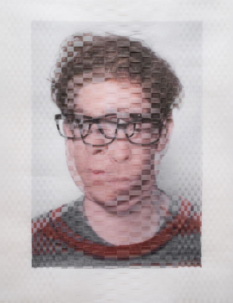
Jennifer lober
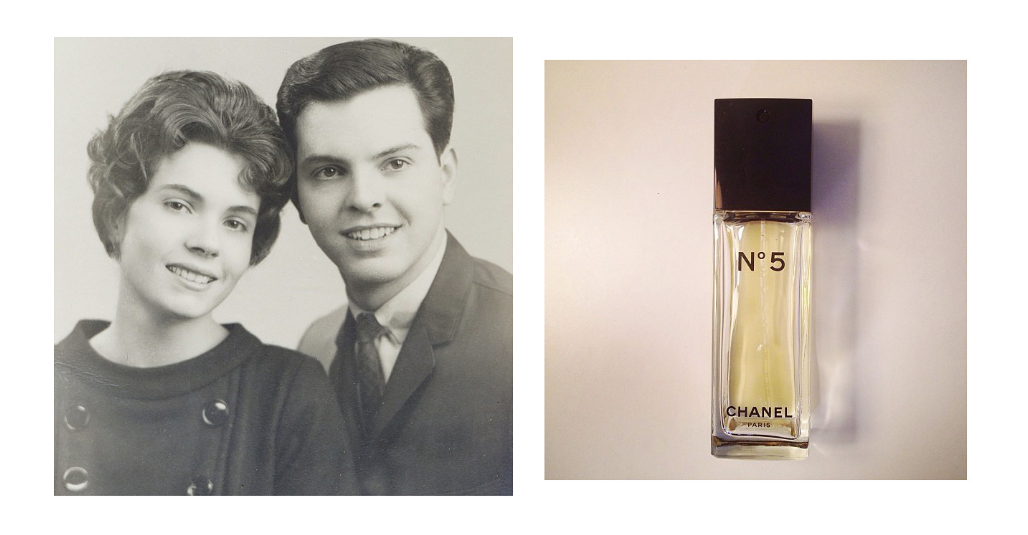
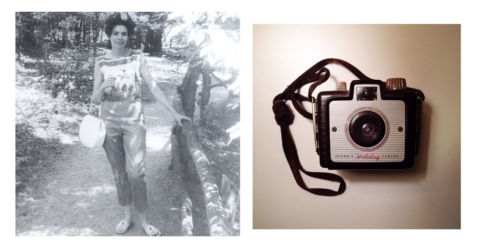 I really like her work I like the way she has made you think about the photo more when there is another photo next to it. The technique she's using is called diptychs. This is where you take the photo and put a different photo next to it to make you think about the actual photo differently. I do like this work because it really makes you think, they're not the best of photos but its a good idea.
Installation
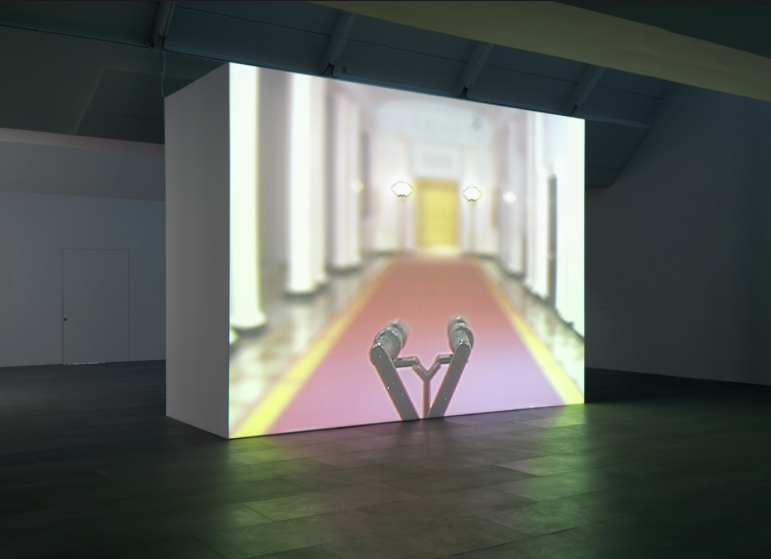
A installation is a for of exhibiting a piece of artwork or a picture in a unordinary way. This is used to draw the attention of the public in more by getting them more involved. Installations are normally more interactive with people sometimes you can touch them or there is a lot more to look at. Sometime its a lot of pictures making one big picture. Some of the time it could just be a picture but covering a whole wall something as simple as that. Installation is usually a 3D piece in a exhibition, Sometimes there is one or two and sometimes the exhibition is just installation.
Digital media in contemporary art
There is a lot of potential for digital media in contemporary art in the design practice. Digital art can be a image, sound, video, animation etc. a photographer who uses this is Wendy McMurdo, she uses normal photography technique but then uses digital media to make it more abstract and into a contemporary art when she makes the same person come into the image twice.
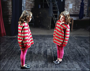 I really like this photo i think its interesting the way she has done it. It looks almost as if the child doesn't recognize herself or is trying to see who she it. You can tell the photographer has enhanced the colors and made the photo look realistic. I do like this work and may try something like this as one of my techniques.
Digital media has been a important role in this because photographers and artistes can use software's such ad photoshop do do touch up on there photographs and make them look a lot better then they would without it.
Subscribe to:
Comments (Atom)


