Matt
Wisniewski
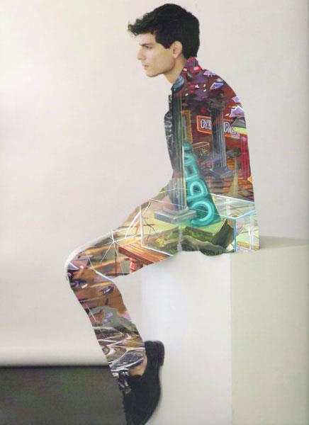
 I really do like his work its interesting hes taking photos of people in a studio and then photos out in the street, then making a double exposure but limiting it to one part of the photo not doing it to the whole thing. I don't think these photos really tell a story or if they're meant to but I just find them really interesting to look at. I like the way he has used black and white with color and used similar colors in the other photo from her jacket and the shop signs.
Wisniewski

 I really do like his work its interesting hes taking photos of people in a studio and then photos out in the street, then making a double exposure but limiting it to one part of the photo not doing it to the whole thing. I don't think these photos really tell a story or if they're meant to but I just find them really interesting to look at. I like the way he has used black and white with color and used similar colors in the other photo from her jacket and the shop signs.
David Samual Stern
Jennifer lober
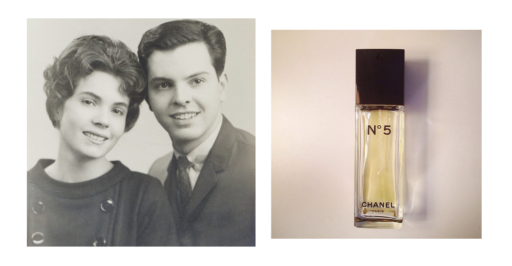
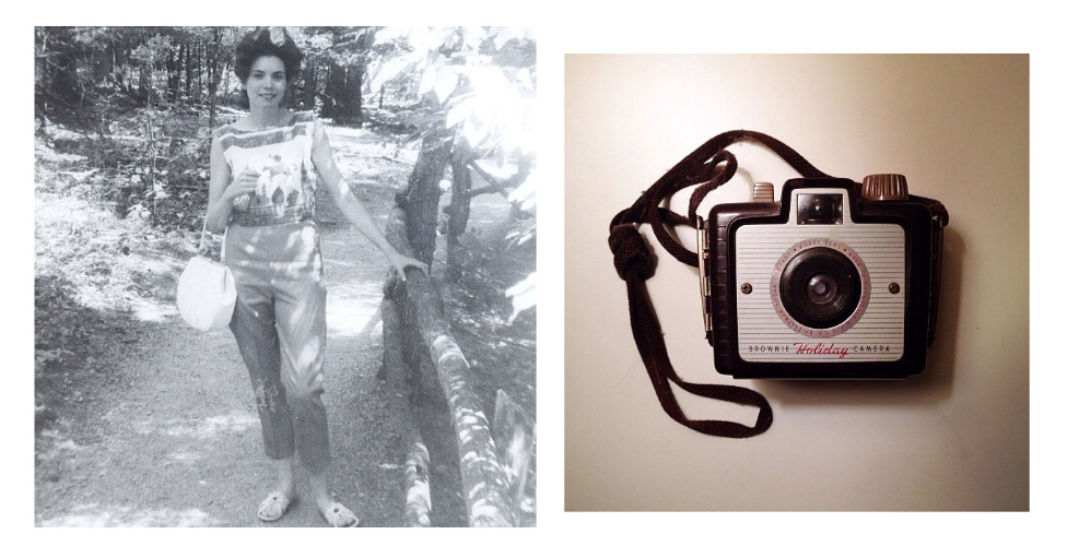 I really like her work I like the way she has made you think about the photo more when there is another photo next to it. The technique she's using is called diptychs. This is where you take the photo and put a different photo next to it to make you think about the actual photo differently. I do like this work because it really makes you think, they're not the best of photos but its a good idea.
Installation
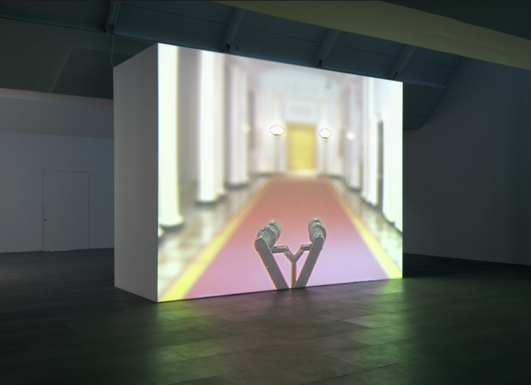
A installation is a for of exhibiting a piece of artwork or a picture in a unordinary way. This is used to draw the attention of the public in more by getting them more involved. Installations are normally more interactive with people sometimes you can touch them or there is a lot more to look at. Sometime its a lot of pictures making one big picture. Some of the time it could just be a picture but covering a whole wall something as simple as that. Installation is usually a 3D piece in a exhibition, Sometimes there is one or two and sometimes the exhibition is just installation.
Digital media in contemporary art
There is a lot of potential for digital media in contemporary art in the design practice. Digital art can be a image, sound, video, animation etc. a photographer who uses this is Wendy McMurdo, she uses normal photography technique but then uses digital media to make it more abstract and into a contemporary art when she makes the same person come into the image twice.
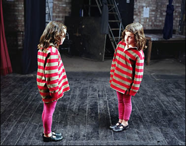 I really like this photo i think its interesting the way she has done it. It looks almost as if the child doesn't recognize herself or is trying to see who she it. You can tell the photographer has enhanced the colors and made the photo look realistic. I do like this work and may try something like this as one of my techniques.
Digital media has been a important role in this because photographers and artistes can use software's such ad photoshop do do touch up on there photographs and make them look a lot better then they would without it.


